Hello Beeper! Today we bring an article that will explain what a call to action or CTA is, what it looks like and how we should present it on our website to help us convert. If you are interested and want to learn more about CTA’s, go ahead!!
WHAT IS A CTA?
A CTA (Call To Action) or Call to Action is a term widely used in the web conversion sector that is used to refer to the web element designed to provoke a positive action or response in our potential client. This is: a sale, a subscription to our mailing list, a request for information, a test of the product or service, etc.
Appearance of a CTA:
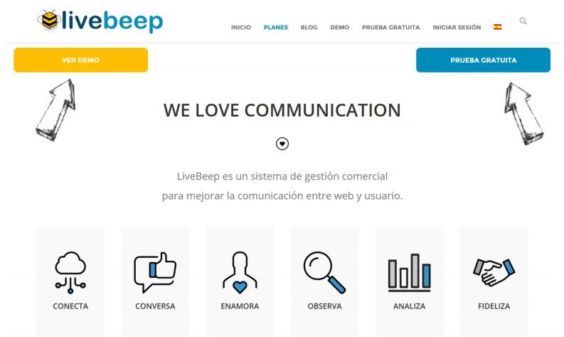
Buttons. Buttons are the most used appearance for CTAs. They must be eye-catching and located in strategic areas of the websites. Using bright colors that contrast with the surrounding elements will help focus the attention of the web visitor. Generally, they are integrated into the design as in the following example:

With Livebeep, you have the integration of buttons in the code of your page, so you can request it whenever you want from our programmers;)
How many CTAs is it recommended to use?
There is no absolute truth to this question. It all depends on how the web is designed, what you want to achieve with CTAs, what reaction you want to achieve in visitors with your CTAs … However, the technique of “being limitedly flexible” is the most common. This means that more than one option is shown to the user but without overwhelming them with too many calls to action. Let’s see it in this example:

There are 3 calls to action in it. One for the test, another for the demo and a third to contact. These 3 options respond to the possible needs that a user presents when reaching this point on the web. To enrich your experience, we offer them all, as a sign of flexibility and adaptability to our visitor, however, we do not recommend more than these three options to avoid overwhelming them.
Avoid Distractions
Another very interesting detail to take into account is the “noise” or distractions that may be around the CTA. The more elements that can be distracting, the lower the effectiveness of the CTA. So we recommend that you use a clean background around your CTAs, that will make them stand out and, probably, more visible for the users we intend to convert.
Use Reinforcements
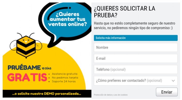
Together with the CTA, you can use messages to motivate or encourage action that will be of great help to achieve the positive response we want. Showing the benefits that your service offers and what it will mean for them and persuading with promotions or offers are good examples of this:
Target your audience strategically
Language is a very subtle element in Marketing. With each certain word, a certain reaction is expected and the proper use of it, I can give us very satisfactory results in the business. A very clear example is the use of the 2nd person singular (the tú); that is capable of breaking the barrier between formality and closeness. In the same way, it happens with imperatives such as “buy now!” or the “try me”; in a very direct way we receive a mandate and its proper use has been shown to yield results. However, with the excess of imperative we risk being rejected and giving an image of excessive authority, so BE VERY CAREFUL!

Squeeze the immediacy factor
Creating a sense of urgency and immediacy through a promotion deadline or with the Limited Edition technique is very effective for online stores selling trend products (fashion, decoration, gourmet food, etc.) or for companies in the sector. leisure (Booking, Atrápalo, Kayak, Yumping, etc.).

With the coupon tool, we managed to create the need for immediacy with the count. If you haven’t tried it yet, we suggest you take advantage of it for special offers or limited promotions. Works like a charm!
Take the opportunity
Imagine that you are looking for a German course on a website and suddenly, an invitation from a virtual advisor appears asking you if you would be interested in attending a free German class to get to know the school and the program first-hand. How likely is this custom CTA to be successful? We assume that more than one that is not, obviously. Take advantage of it! And so far our post today,
I hope that, from now on, CTAs can help you convert more and better!


 Español
